


Brand Logo Usage & Style Guide
This guide outlines the correct use of our brand logo across all digital and print applications. It defines approved logo variations, spacing, sizing, color treatments, and placement rules to ensure visual consistency and brand integrity in every context.
Logo System Overview
The Commonhealth Psychological logo system is designed to balance clarity, professionalism, and warmth across print and digital environments. Consistent application of the logo reinforces trust, clinical credibility, and brand recognition.
The logo system consists of:
- Primary Logo
- Icon-Only Mark
- White-Only Logo
- Supporting Logo (Reversed)
Each version serves a distinct purpose and should be used intentionally based on background, scale, and context.
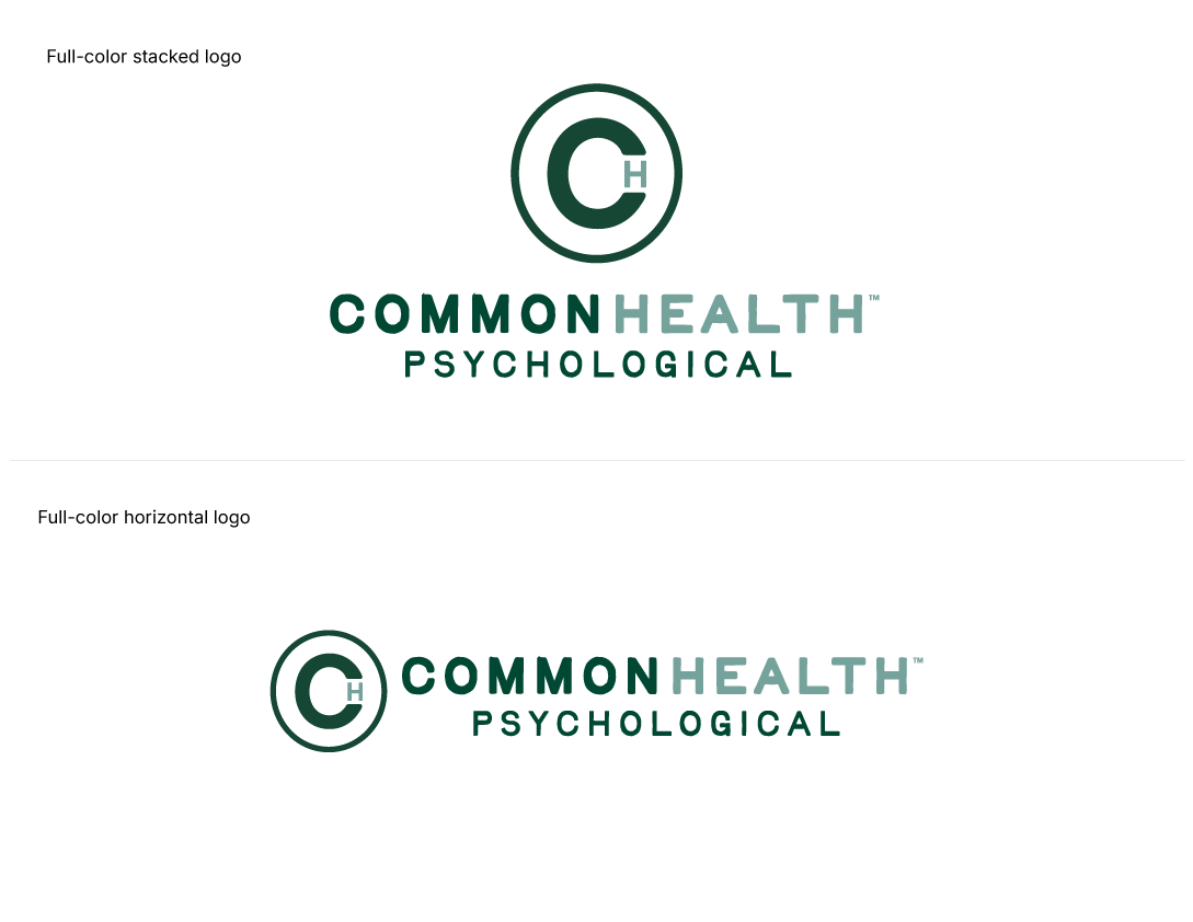
Primary Logo
The Primary Logo is the preferred and most complete expression of the Commonhealth brand.
Usage
- Use whenever space allows
- Primary applications include:
- Website headers
- Print materials
- Presentations
- Signage
- Marketing and communications
Approved Versions
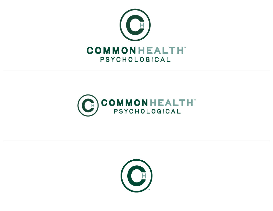
- Full-color stacked logo (icon above wordmark)
- Full-color horizontal logo (icon to the left of wordmark)
Guidance
- Always use official logo files
- Maintain original proportions
- Do not recreate, redraw, or typeset the logo
- This version should be the default choice whenever possible
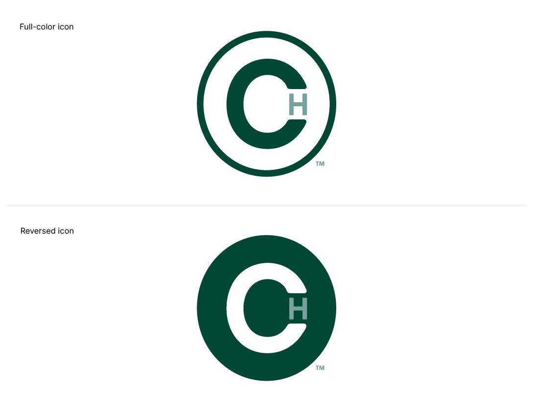
Icon-Only Mark
The Icon-Only Mark is a simplified brand element derived from the primary logo. It is intended for compact or shorthand use where the full wordmark is not practical.
Usage
- Social media avatars
- Favicons
- App icons
- Digital navigation elements
- Small-scale environmental or wayfinding applications
Approved Versions
- Full-color icon
- Reversed icon
Guidance
- Use sparingly and intentionally
- Do not substitute for the full logo in formal or primary brand communications
- Ensure legibility at small sizes
- Maintain adequate clear space
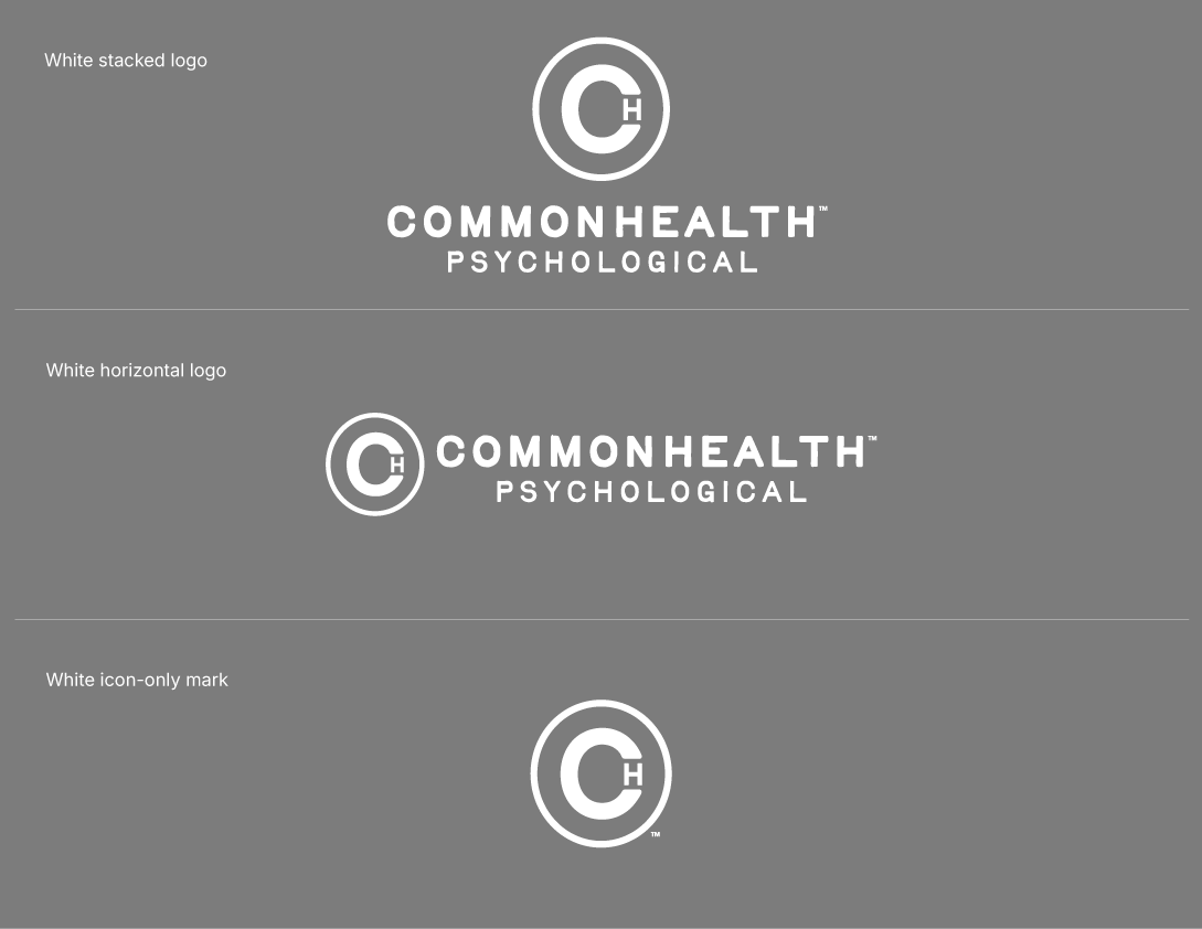
White-Only Logo
The White-Only Logo is reserved for high-contrast use on dark backgrounds where color reproduction is limited or where a simplified visual presence is preferred.
Usage
- Black or very dark backgrounds
- Dark photography
- Minimal, high-contrast layouts
- Select digital or environmental applications
Approved Versions
- White stacked logo
- White horizontal logo
- White icon-only mark
Guidance
- Use only on dark backgrounds
- Do not apply to light or mid-tone backgrounds
- Do not recolor, tint, or alter opacity
- Avoid placing over visually complex imagery
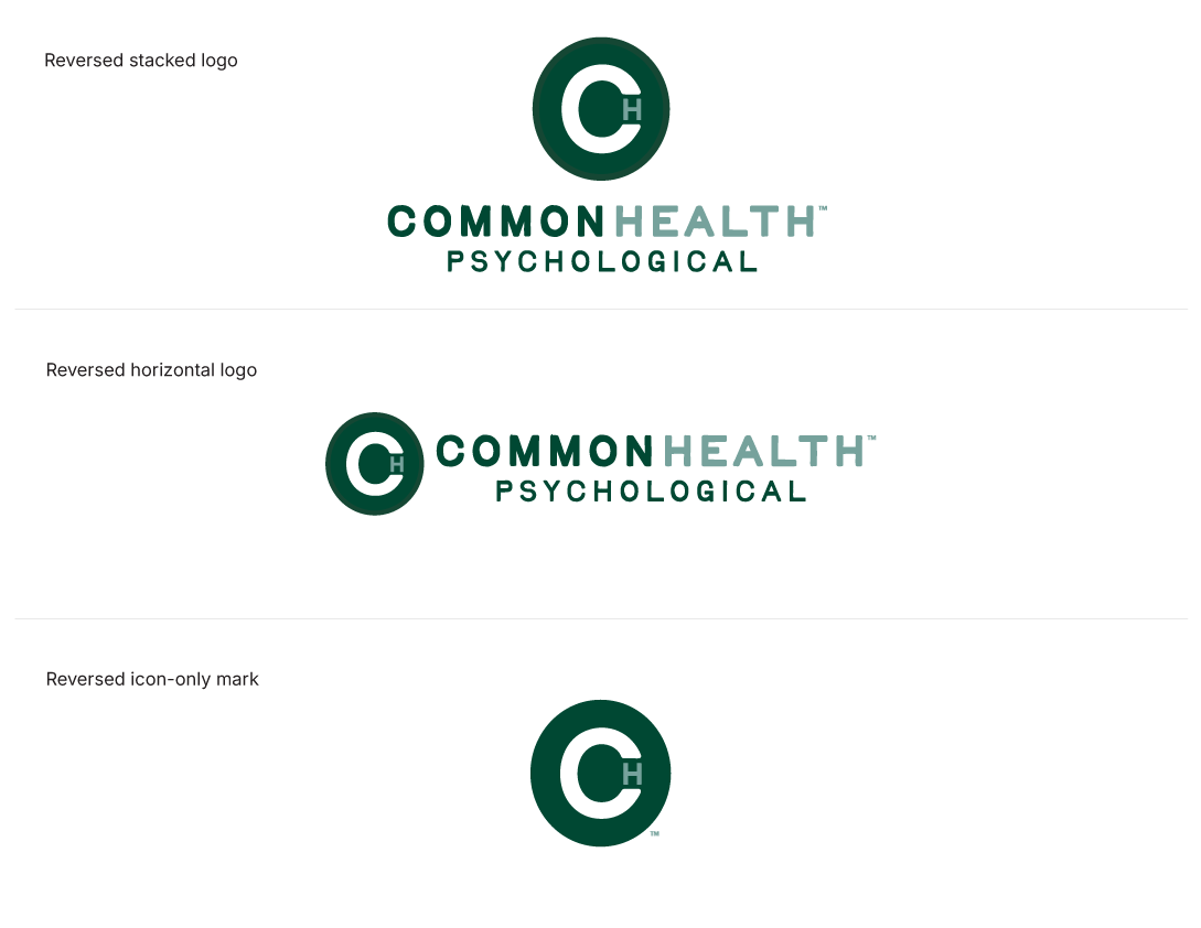
Supporting Logo (Reversed)
The Reversed Logo is designed for use on dark or saturated backgrounds, or in situations where a dark icon or mark needs to visually pop against its surroundings.
Usage
- Dark photography
- Brand green, charcoal, or black backgrounds
- Digital overlays and environmental applications
- Situations where a darker mark provides stronger contrast and visual emphasis
Approved Versions
- Reversed stacked logo
- Reversed horizontal logo
- Reversed icon-only mark
Guidance
- Ensure strong contrast between the logo and its background
- Select the reversed version when a darker mark improves legibility or visual impact
- Avoid visually busy or low-contrast backgrounds
- Do not add outlines, shadows, or effects
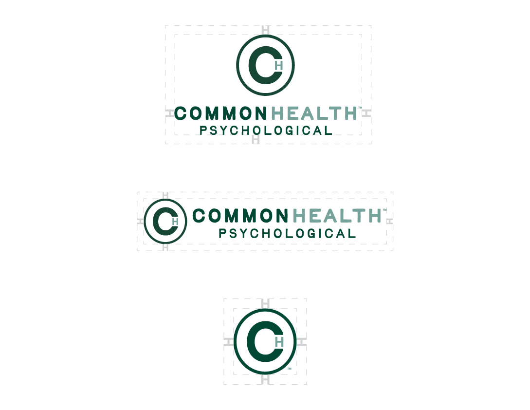
Clear Space
To protect legibility and visual integrity, the logo must always be surrounded by adequate clear space.
Clear Space Rule
- Minimum clear space equals the height of the inner “H” within the icon
- No text, imagery, or graphic elements may enter this space
This rule applies to:
- Primary logo
- Icon-only mark
- White-only logo
- Reversed logo
Minimum Size
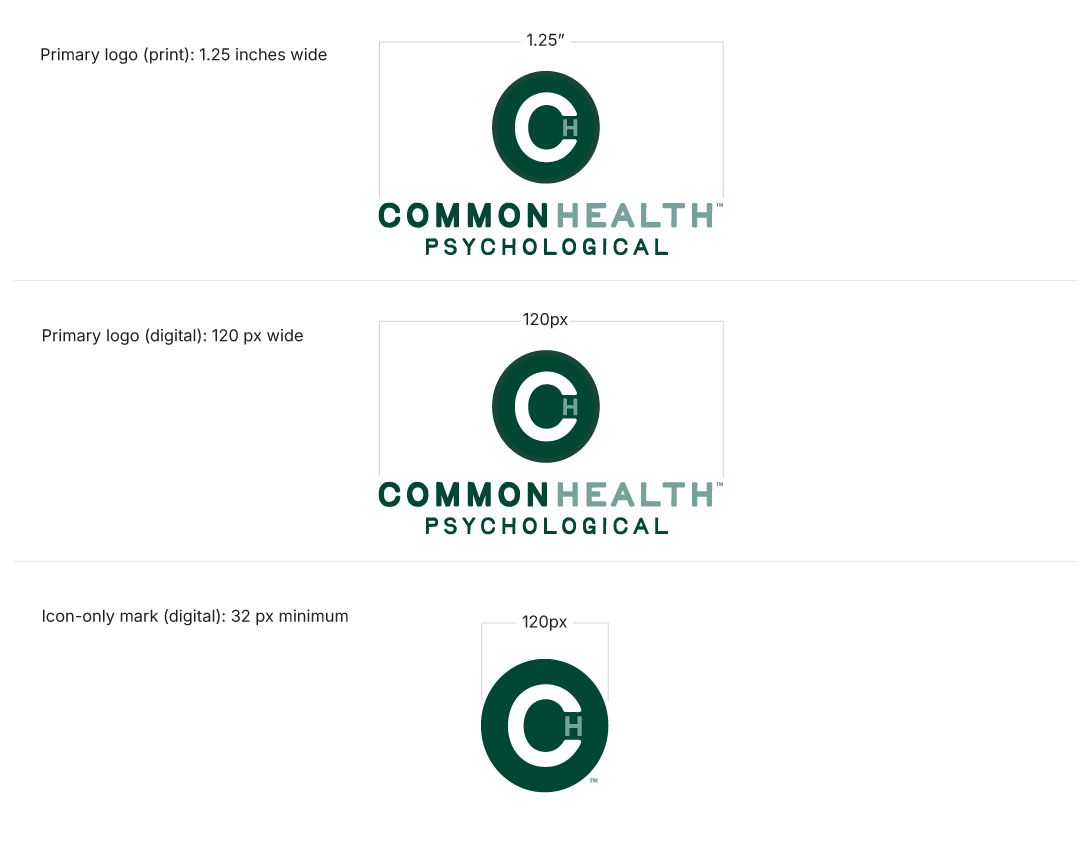
To maintain clarity and legibility across applications, observe the following minimum sizes:
Minimum Sizes
- Primary logo (print): 1.25 inches wide
- Primary logo (digital): 120 px wide
- Icon-only mark (digital): 32 px minimum
If legibility is compromised, increase size or use an alternate approved version.
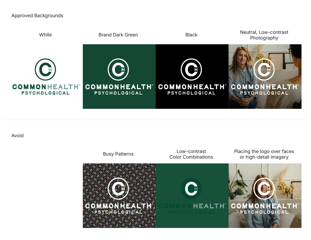
Background Usage
Approved Backgrounds
- White
- Brand dark green
- Black
- Neutral, low-contrast photography
Avoid
- Busy patterns
- Low-contrast color combinations
- Placing the logo over faces or high-detail imagery
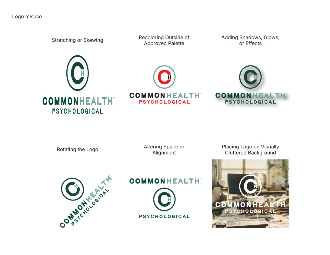
Logo Misuse
To preserve consistency and professionalism, the following treatments are not permitted:
✕ Stretching or skewing
✕ Recoloring outside the approved palette
✕ Adding shadows, glows, or effects
✕ Rotating the logo
✕ Altering spacing or alignment
✕ Placing the logo on visually cluttered backgrounds
Always use official logo files exactly as supplied.
Trademark Usage
The ™ symbol is included in official logo artwork and must remain intact.
Guidance
- Do not remove or reposition the trademark
- Use only logo files that already include ™ as provided
Color Palette & Hierarchy
This color hierarchy defines how brand colors should be prioritized and applied across print and digital environments to ensure consistency, clarity, and strong brand recognition. It establishes a clear structure for using core, accent, and neutral colors across all brand touchpoints.
Core Brand Greens lead the visual identity, accent colors provide controlled emphasis, neutrals support balance, and a dedicated digital-first green is reserved for screen-based applications requiring added contrast and depth.

Core Brand Greens
Primary Green
- Pantone: 343 C
- HEX: #154734
- RGB: 21, 71, 52
Secondary Green
- Pantone: 5575 C
- HEX: #7FA19C
- RGB: 127, 161, 156
Usage
- Foundational brand colors
- Primary Green leads all brand expressions
- Secondary Green supports layouts, backgrounds, and secondary brand moments
- Approved for both print and digital applications

Secondary & Tertiary Accent Colors
Primary Mustard
- Pantone: 7563 C
- HEX: #D69A2D
- RGB: 214, 154, 45
Secondary Mustard
- Pantone: 7409 C
- HEX: #F2C94C
- RGB: 242, 201, 76
Usage
- Supporting accents
- Highlights, callouts, and secondary UI elements
- Used sparingly to complement the core greens

Tertiary Neutral
Sand
- Pantone: 2309 C
- HEX: #D8C9A3
- RGB: 216, 201, 163
Usage
- Backgrounds
- Subtle warmth in layouts
- Supporting print and digital applications

Digital / Website Color
Deep Green (Digital-First)
- Pantone: 3308 C
- HEX: #0E2C2D
- RGB: 14, 44, 45
Usage
- Approved for digital environments requiring increased contrast and depth
- Website backgrounds and digital UI elements
Guidance
- Should not replace Primary Green in print applications
- Reserved for screen-based use only